Choosing Glass: Color and Impressions
| Choosing Glass: Color and Impressions |
| Robert Oddy |
In the last issue of Glass Craftsman, I said that, for me, the choice of glass is probably the most important factor contributing to artistry in stained glass. Tiffany’s company made glass for specific purposes, and raised the medium to a new level of expressive power. Now, we have a huge selection of stained glass available for our creative purposes. We just have to make the effort to familiarize ourselves to what is out there.
I am writing from the perspective of my chosen artistic domain, which is the traditional stained glass fabrication with copper foil. I do not search the whole world of art technique for the effects I wish to create. I am interested in what I can achieve within the limits of soldered copper foil lines. In case you are beginning to think that I am a dogmatic purist, I must tell you that I have no dogma or axe to grind – I frequently bend my own rules! The point of working mainly within technical limitations is that you examine more closely the potential of your chosen materials and techniques.
 |
| Figure 1: Hybrid Tea Rose |
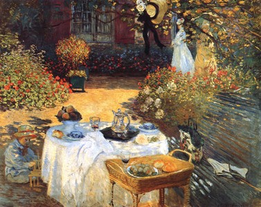
Depicting natural subjects in a representational way in stained glass is akin to the painting style called impressionism. Wikipedia defines impressionism as “re-creating the sensation in the eye that views the subject, rather than recreating the subject”. This distinguishes it from a detail-oriented, photographic approach to representation. With the form of stained glass art that I choose to practice, photographic realism is not possible. Lead lines are simply not adequate to create the right impression. We need to make the glass speak for us, to take advantage of it’s texture and color variations and subtlety. We will not get exact details, but we can rely on the eye and brain of the viewer to understand.
 |
| Figure 2: The Luncheon (C. 1872) Claude Monet |
There are two steps in choosing glass for a piece of stained glass art: (i) We choose a sheet with potential, and (ii) For each individual piece in the panel, we choose a part of the sheet that has the characteristics we want. For most of the glass I buy, I much prefer to go to the supplier and choose the sheets myself, rather than trusting to mail order. I look for interesting features or color variations that I will be able to exploit.
 |
| Figure 3: Central New York |
| (1989) 44″ x 27″, Robert Oddy |
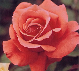
We are capable of perceiving and distinguishing millions of shades of color – if this were not so, there would be no point in having 24-bit color codes in computer graphics programs. Yet we still say that leaves are green and roses are red! If we carry this simplification through to the choice of glass for a stained glass composition, we will end up with something that resembles a child’s “paint-by-numbers” picture. Look at the photograph of a rose in Figure 1. We know that it is almost monochromatic. If you laid the petals out flat on a well-lit table, there would be little color variation. But look at the colors you actually see in the photo – not that which you think you see.
 |
| Figure 4: Roses (1998/9) detail |
| Robert Oddy |
The variation is due to the lighting conditions – a main source of light, such as the sun, and some ambient light – and to the curvature of the petals. If we can imitate this or suggest this by clever choice of glass, our work will come alive. As artists, we should be aware that color perception is not always obvious. Figure 2 is Monet’s painting The Luncheon. There are a number of white objects in the picture: the table cloth, the parasol on the bench, the woman’s dress, the child’s shirt, the silver coffee pot. But there is very little pure white paint! Even the bright areas are tinted with yellows and blues. Monet knew that he should leave it to the brain of the viewer to do the interpreting, not to do it himself, in the painting. This way, the viewer would understand the total scene, and the relationships between the various features at that moment in time.
Let me give you some examples from my own work:
 |
| Figure 5: Playing Hands (1999) |
| 10″ each side, Robert Oddy |
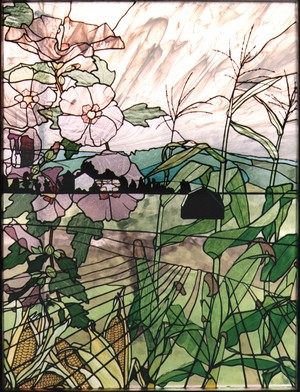
Figure 3 is called Central New York because it is a, somewhat stylized, depiction of a landscape typical of that region. The sky is made with a light white on clear streaky glass. As often happens with white glass, it looks a little amber. The clouds are blowing towards the viewer. I took account of perspective, so the streaks in the glass are arranged to fan out towards the viewer. This gives the impression of spaciousness, and also of movement.
 |
| Figure 6: Rhododendron |
| (2000) 24″ x 14″, Robert Oddy |
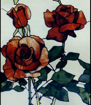
The hybrid tea rose in Figure 4 is one of ten different roses in a pair of sidelights. The whole composition uses several different greens for leaves. In this section, a dark mottled green gives the impression of shadows and imperfections in the leaves. Note especially the choices of red glass in the rose blossoms.
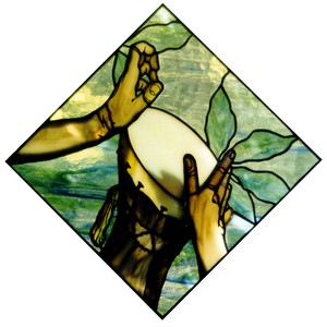
Playing Hands in Figure 5 is a miniature panel for a door. The body of the drum is in one piece of chocolate brown glass, chosen to give the impression of a cylindrical shape. It has a light stripe sandwiched between two dark areas. Also, look at the creases and contours in the wrist and hands, which are suggested by carefully chosen pieces of amber glass.
 |
| Figure 7: Tiger #2 (2004) |
| ornament with carved wood, 9″ x 14″, Robert Oddy |
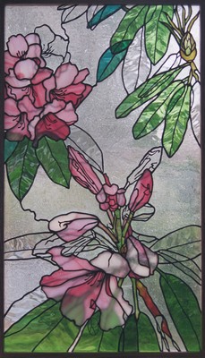
Figure 6 shows a panel called Rhododendron. Here, I want to point out the use of Spectrum’s waterglass to represent the leathery leaves. Note the direction of the ripples.
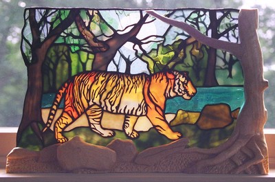
In Tiger #2 (Figure 7), I chose a part of the sheet with a transition from yellow to white for the body of the tiger, so that the animal would have the characteristic white belly.
 |
| Figure 8: Tribute to Monet |
| (2006) detail, Robert Oddy |
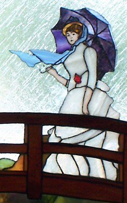
Figure 8 is a detail from Tribute to Monet, showing a woman based on one of Monet’s women with parasols. It is raining in my piece, so she holds an umbrella instead of a parasol! The tones in the umbrella are chosen to make it look rounded, and to contrast with the woman’s hat and scarf. Her dress is made of Uroboros’s drapery glass. The pieces are chosen to show folds in the material and her lovely figure.
 |
| Figure 9: Seville |
| (2009) 38″ x 34″, Robert Oddy |
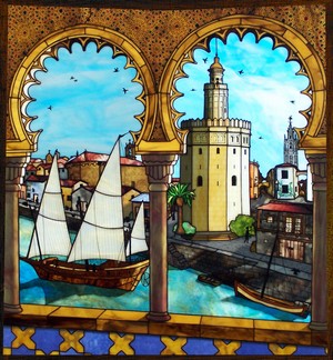
Finally, a slightly fanciful depiction of historical Seville, Spain, is shown in Figure 9. Throughout this design, I was conscious of the direction of the light source (i.e. where the sun is in the sky). This determined where the shadows and highlights should be. Some of the deeper shadows were produced by plating (attaching a second layer of glass behind the front layer).
Don’t be like the sad little boy in Harry Chapin’s song, repeating an uninspired art teacher’s words: “Flowers are red, green leaves are green. There’s no need to see flowers any other way Than the way they always have been seen.”
Notice the variations in colors that your eye perceives, and how your brain interprets these to imagine the living world. Look for features in the glass that you can use to create impressions. Be like Michelangelo, who fancied that, when he sculpted, he was discovering the figures that already resided in the marble!
web: www.robertoddy.com | mail: artist@RobertOddy.com | phone: (315) 200-2260
